Showing posts with label Musings. Show all posts

Tuesday, April 9, 2013

What Does the Nation’s Declining Employment-Population Ratio Really Reflect?

Click to Enlarge
As unemployment rates across the nation (and here in Utah) continue to drop, many media pundits have turned to the employment-population ratio to find their daily dose of economic gloom and doom. (Of course, by providing negative news, they are just supplying what the public appears to demand.) However, is the shrinking employment-population ratio really bad economic news?

The employment-population ratio is a figure produced by the Bureau of Labor Statistics. Just like the unemployment rate, it is generated from responses to the Current Population Survey (or CPS in acronym parlance). It represents the percent of the population 16 years and older that is employed. Kind-of, sort-of the yin to the unemployment rate’s yang. For example, one commentator, indicates that the fact that the employment-to-population ratio has declined “paints a much bleaker picture of the job market than the unemployment rate.”

Is this true? On the surface, indeed the employment-to-population ratio has declined noticeably since the recession began. But before we paint too bleak a picture, let’s outline the major reasons why the ratio is declining

The Bottom Line?

The decline in the employment-population ratio began long before the current recession.

• An increase in unemployment during the recession resulted in a sharper downturn during the recession, but that effect is moderating as the economy expands.

Click to Enlarge
• The primary cause of the continued decline in the employment-population ratio is decreasing labor force participation among teenagers (16-19 years old) and young adults (20-24 years old).

• Labor force participation has actually increased for workers 55 years and older.

• The shrinking of the population in the prime workforce years (35-44) also plays a role in the overall drop in the employment-population ratio.

• Finally, the decline in the employment-population ratio is primarily due to less labor force participation among young people and the aging of the baby-boom and baby-bust generations.

If you are interested in a fuller (and longer) explanation, read the narrative after the "jump."


 What are the factors currently influencing the employment-to-population ratio?


Unemployment—the very fact that unemployment increased during the recession would cause the employment ratio to decline.

Click to Enlarge


Labor Force Participation—this figure is the percentage of civilian, noninstitutional population over the age of 16 who are “participating” in the labor force. In other words, these folks are employed or considered “unemployed” which requires some sort of active work search. Those who have removed themselves from the labor force for whatever reason—school, home responsibilities, retirement, health, discouragement, etc. will not be counted in labor force.

Demographics—particularly age. Some age groups are more or less likely to participate in the labor force or have higher or lower unemployment rates. For example, the very old and the very young are less likely to be in the labor force. Changing population shares of different age groups will affect the overall employment-to-population ratio.

The employment-population ratio started to edge down long before the recession began. (Chart 4.)

The recessionary drop for men proved sharper than for women. This makes sense since men typically show higher unemployment rates during an economic downturn. Men are more likely to be employed in industries hardest hit by recession—manufacturing, construction, etc.
Click to Enlarge

Employment ratios for those over 55 have actually increased in recent years and are higher now than in 2002. This probably due to less early retirement. The recessionary decline in 401ks and other investments may have caused older workers to defer retirement. On the other hand, baby-boomers may just be following through on their polled intention to keep working later than earlier cohorts. (Chart 2)

The largest declines in employment-population ratios are exhibited by the youngest workers. In particular, teenagers are much less likely to be employed in 2011 than in 2002 (Chart 2).

This decline in the employment-population ratio tracks with the decline in participation rates for young people. Again, this drop occurred long before the recession began. Participation rates for teenagers have slipped from 47 percent to 34 percent in less than a decade. More school attendance may be to blame. However, this contraction in labor force participation may also reflect a change in cultural values regarding teenagers and work.

Traditional economic theory may also provide a bit of an answer to the dwindling labor force participation among teenagers. Young people are disproportionately more likely to work for minimum wage. Economic theory indicates that if a price floor (such as a “minimum wage”) is higher than the natural market wage rate, fewer jobs will be available for those workers. Recent notable increases in minimum wage may be forcing young people out of the labor market.

Of course, participation rates for those 20-24 years of age have also fallen from 76 percent in 2002 to 71 percent in 2011. Increased full-time school attendance seems the most likely reason behind this change.

On the other hand, participation rates for workers over 55 years of age increased over the same time period. Participation rates for the age groups representing the bulk of workers—25 to 54 have also declined over the past decade. However, this slip occurred long before the most current recession and kept on dropping right through the “boom.”

In addition, the civilian population for most age groups has increased in the last ten years. Growth has been particularly strong in cohorts which include baby-boomers (no surprise here). However, the population in the prime working years—35 to 44 has declined steadily as baby-boomers left the age group to be replaced individuals from the baby bust. This age category accounted for 20 percent of the

The Truth about Discouraged Workers and the Declining U.S. Unemployment Rate

Recently, many individuals in quoted in the mainstream media have attributed the nation’s falling unemployment rate to an increase in discouraged workers. Discouraged workers are those who have left the labor force because they believe they would not be able to find work if they did try to find a job.

To be counted as “unemployed” and therefore part of the labor force, an individual must have actively looked for work sometime during the prior four weeks. Honestly, the standard for “actively” seeking employment is fairly low. Asking your brother-in-law if he knows of any available jobs would count.

The Bureau of Labor Statistics has specific standards for including individuals in the “discouraged” category. Discouraged workers would like a job, but have made no active work search in the preceding four weeks. They think that no work is available, they wouldn’t be able to find a job, employers think they are too young or too old, etc. So, they’ve stopped looking for work.

In the current economy, has an increase in discouraged workers contributed to the decline in the U.S. unemployment rate? It is an interesting theory, but the data say, “no!”

Because, yes, the Bureau of Labor Statistics actually estimates discouraged workers based on responses to the Current Population Survey. That’s the survey that brings us the unemployment rate. The following visualization shows discouraged worker counts for the United States. Data are not seasonally adjusted so there’s a wide variability in in the month-to-month numbers. However, the data make it clear that the number of discouraged workers actually declined during most of the past two years. Throwing in a 12-month moving average illuminates that fact even more clearly.

Wednesday, March 27, 2013

How much does today’s lifestyle cost in 2040?

We were talking about inflation the other day with a client, and found ourselves with pen and paper drawing rectangles increasing wildly in size. Are those scales right? How much will the lifestyle they live today actually cost in 2040?

[Future Advisor] took data from the U.S. Bureau of Labor Statistics and calculated a “cost of lifestyle” for 2040. Future Advisor


Thursday, January 3, 2013

Economists See (OK-ish) Growth In 2013

Suddenly, the new year is looking a bit brighter — at least in the eyes of most economists and investors.
On Day 1 of 2013, Congress voted to veer away from the "fiscal cliff" by passing a package of provisions that avoided broad tax hikes and big spending cuts. And on Day 2, stock prices shot up

Yes, there will be new budget battlesin February, after President Obama has had his second inauguration and the 113th Congress has gotten itself organized.

But for now at least, Americans can take some comfort in having more policy certainty about taxes. And that helps businesses with their planning for the new year, according to John Canally, an economist for LPL Financial, an investment-adviser consulting firm.

Like most other economists, both Hopkins and Canally say growth will continue in 2013, but not by a robust pace. That's because part of the legislation passed Tuesday by Congress will end the payroll tax holiday, which had been in place for two years. That will reduce take-home pay for all workers.

The payroll tax comes back now and that will affect everyone right away," Canally said. "It will be a drag on the economy" because the typical household will have roughly $1,000 less to spend this year, compared with 2011 and 2012.

On the other hand, the rebuilding efforts in parts of the country hit by Hurricane Sandy this past autumn will generate jobs and spending, he noted. On balance, the economy should grow at about 2 percent in 2013, which would be roughly the same pace as 2012, he said.

That forecast is in line with other mainstream economists. The consensus is that growth will be well below the 3 to 4 percent expansion rate that would generate strong job growth and better incomes. But it should be enough to continue to whittle down the 7.7 percent jobless rate and keep the recovery growing into its fourth year.  Utah Public Radio

Friday, November 23, 2012

Is The End of the Smartphone Era is Coming?

You've heard that Google is working on computerized glasses. They're called Google Glass, and developers can already buy them.

It turns out Microsoft is working on something similar. It filed some patents on the project.
There's a big difference between what Microsoft is working on and Google Glass.

The most recent word out of Google is that Google Glass isn't going to use "augmented reality" – where data and illustrations overlay the actual world around you.

Google Glass is actually just a tiny screen you have to look up and to the left to see.


Microsoft's glasses seem to utilize augmented reality. In a patent illustration we've embedded below, you can see that the glasses put data on top of a live action concert and a ballgame.

Nicholas Carlson at Business Insider thinks something like Google Glass or what Microsoft is working on could end up replacing the smartphone as the dominant way people access the Internet and connect to each other.

Read the rest of Nicholas Carlson’s article at Business Insider

Wednesday, October 17, 2012

The rise of the 'sharing economy'

A number of social startups are applying the concept of sharing in ways that just might change the very nature of business. Collaborative consumption, access over ownership, peer-to-peer — regardless of the nomenclature, an economy of sharing is spreading fast.

By now, most people are familiar with Craigslist, a classified advertisements website serving more than 700 cities in 70 countries. Take the Craigslist model of providing an online space for people to post items or services they want to buy, sell or give away. Then customize that model to specific industries, add some mobile apps and the result is companies such as Airbnb, RelayRides and Threadflip, which facilitate peer-to-peer markets for accommodations, car rentals and the resale of high-end fashion products.

A recent article in the Christian Science Monitor highlights three general business models used in the "sharing economy."

A story in Fast Company points out, the “access over ownership” model has always had a place within the larger economy. Laundromats and video rental stores are two examples. The peer-to-peer model has existed in such forms as bake sales and ski swaps, and the free-exchange model has been around as long as neighbors have been lending each other cups of sugar. The difference now is that technology has enabled the exchanges to take place on a much broader scale and in a de-institutionalized and individualized manner, most often between perfect strangers. Deseret News

Friday, March 9, 2012

How Much is a Homemaker Worth?

The life of a homemaker is one that includes an endless amount of demands and to-dos. Depending on the size of the home and family, the position of homemaker can go well beyond the usual nine to five. In an article by Investopedia, they only took into consideration tasks which have monetary values and used the lowest value for each calculation.

Meal preparation is one of the major tasks of most homemakers. Grocery shopping is another chore that needs to be factored in. A homemaker must drive to the supermarket, purchase the food and deliver it to the home. Total cost for services: $52,260 per year.

A clean and tidy home is the foundation of an efficient household. Typical cleaning duties include vacuuming, dusting, sweeping, scrubbing sinks as well as loading the dishwasher and making beds. Additional tasks such as oven or refrigerator cleaning and dusting mini blinds can run extra. Total cost for services: $6,136 per year.

Homemakers provide full-time, live-in child care. This type of service from a professional provider would usually come with a host of perks including health insurance, paid vacation and sick days, federal holidays off, dental and vision coverage, and bonuses. Total cost for services: $31,200 per year.

A private car service might seem like a high-end luxury to most, but the beneficiaries of a homemaker get this service on a daily basis. otal cost for services: $4,168 total per year.

Clean clothes come at a cost when you have to pay for the service that most homemakers do for free. Professional laundry services charge by the pound. Total cost for services: $936 total per year.

Total for a year of all services is: $52,260 + $6,137 + $31,200 + $4,168 + $936 + $1,560 = $96,261 per year.

The daily work of a homemaker can sometimes be taken for granted by his or her family members. However, these services could earn a homemaker a considerable wage if he or she took those skills to the marketplace. Homemakers in general contribute a lot more to the home in addition to these tasks, and no amount of money can fill those needs. Investopedia

Thursday, February 23, 2012

Educational Attainment in Utah and the U.S.

The Census Bureau just released U.S. educational attainment data for 2011 from the Current Population Survey (the monthly survey which also reveals the U.S. unemployment rate) along with several other studies profiling education demographics from other surveys. The biggest news? Using the Current Population Survey shows the percent of the U.S. population 25 and older with at least a bachelor's degree hit 30 percent for the first time. These reports include a lot of interesting information about educational attainment by gender, race/ethnicity, field of study along with the effects of educational attainment on earnings and unemployment. You can access the press release by clicking here.

While many of the surveys used in the Census Bureau reports aren't sufficiently large to provide state-level data, the American Community Survey (ACS) does provide educational attainment insights. Currently, only 2010 ACS data is available. You'll notice from the chart below that the 2010 ACS data shows the U.S. with bachelor's degree attainment at 28.2 percent compared to the 2011 Current Population Survey figure of 30.4 percent. (Different surveys, different years.)

Where does Utah rank? With a 29.3 percent college-educated share of the 25 and older population, Utah ranks just above the U.S. average of 28.2 percent. In the past, Utah's population did much better in attaining a college education than did the nation as a whole. Over time, both Utah and the U.S. have seen educational levels rise. However, since 1980, the U.S. share of the population with a college education has risen faster than has Utah's share. Indeed, Utah's high point in the educational attainment race occurred in 1980 when roughly 20 percent of the population had a bachelor's degree or higher compared to 16.2 percent for the U.S. From that point, the Utah-U.S. education gap has narrowed to its current 1.1 percentage point difference.


What happened to Utah's educational edge? In this case, we can trace Utah's declining educational gap to Utah women. Utah men still show bachelor's degree attainment (32.4 percent) significantly above their U.S. counterparts (28.5 percent). On the other hand, Utah women (26.4 percent with a bachelor's degree or higher) fall behind U.S. females (27.9 percent with a bachelor's degree or higher. Until 1980, Utah women showed higher bachelor's degree attainment than did U.S. women. In other words, Utah women have just not kept up with U.S. women, U.S. men or Utah men in obtaining a college education. In fact, Utah shows by far the largest college-education gender gap of any state in the nation.


Within Utah, major metropolitan areas are more likely to maintain a higher-than-average level of bachelor's degree attainment than are rural areas. Of course, it also seems to help to have a well established 4-year University in your county to bolster college education rates--note Cache and Iron counties. In order to have data for all 29 Utah counties, I used the 2006-2010 ACS averages.


Wednesday, February 8, 2012

Just for Fun. . . The Super Bowl stock market indicator

It’s one of those things that’s too much fun not to pay attention to this time of year; I’m talking about the Super Bowl Stock Market Indicator.

This nutty little barometer that seemingly has nothing to do with stocks has been correct in 35 of the past 45 years by asserting that the when a team from the old National Football League (before the 1970 AFL-NFL merger) or a team from the National Football Conference wins the Super Bowl, large cap U.S. stocks will advance for the year. A champion from the AFC or old American Football League is supposed to bring out the bears. This suggests that a win by the NFC’s New York Giants over the AFC’s New England Patriots in Super Bowl XLVI in on Sunday would be bullish for stocks. John Dobosz for Forbes.

Monday, January 30, 2012

Utah births still declining

The official 2011 tally from state health officials is not yet available. But three major hospital chains — which together welcome most of Utah’s babies — say their delivery numbers remained flat or continued to drop. Utah, long home to the nation’s highest fertility rate, reached its zenith in 2008 with 55,605 newborns. But statewide births have slowed every year since then, with 52,164 counted in 2010.

The drop has widely been attributed, at least in part, to the lingering impact of the recession. Salt Lake Tribune

Note: I've added a chart showing recent Utah birth data from the Utah Department of Health. If past history holds true (i.e. the Great Depression), the declining number of births in Utah may indeed have a recession-related component. However, it may also reveal a demographic element. You'll notice that the last dip in Utah births occurred in roughly 1982 to 1987. (A second echo of the baby bust of the Great Depression and WWII.) Women born during those years are now in their prime child-bearing years. In other words, fewer women, fewer births.


Friday, January 27, 2012

Utah ranks among states with the least credit card debt

Americans cut down their credit card debt by 11 percent last year, compared to 2010, according to a new report by Credit Karma. 24/7 Wall St. looked at the average credit card debt owed by the residents of each state to determine the five states with the most and the least debt as of December 2011.

According to this report, Utah ranked number four among states with the least debt:

Utah
  •  Credit card debt: $5,816
  •  Median household income: $54,744 (13th highest)
  •  Average credit score: 673 (5th highest)
  •  Cost of living: 5th lowest
Utah is relatively wealthy, with a median household income of nearly $55,000. Despite this, the cost of living in the state is the fifth-lowest in the country. With high incomes and a low cost of living, Utahns maintain conservative personal debt, illustrated by their fifth-highest average credit score. 24/7 Wall St.

Note:
Hold on! Utah is relatively wealthy? Can this be true? Like most people, we Utahns tend to focus on the negative. . .our lower-than-average wages, low per capita income, etc. However, 24//7 Wall St. is correct. Utah does have the 13th highest state median household income in the U.S. according to the American Community Survey. Utah's median family income ($54,744) measures notably higher than the U.S. median income ($50,046). We don't fare quite so well in the median family income rankings--22nd. But, Utah's median family income ($61,618) still measures above the national figure ($60,609).

Utah's unusual demographics are behind the seeming dichotomy between lower-than-average per capita incomes and wages. We have the highest share of population in the country under the age of 18 (with little or no income) which dilutes are per capita income figures. Location, cost-of-living, industrial mix, and lots of young workers also tend to skew our average wages to the low end.

What keeps Utah's family and household incomes higher than average? Utah families and households do tend to have more workers per household than households nationally. Plus, Utah's income distribution with fewer households at the high and low end of the income scale than the U.S. generally likely contributes to Utah's relatively good income standing.


Wednesday, September 14, 2011

What is "Poverty?"

With new a new report on United States poverty just released by the U.S. Census Bureau, it seems a good time to review just how those murky poverty rates are calculated.

It all started back in 1964 when the Office of Management and Budget (OMB) directed the Social Security Administration (SSA) to develop the original poverty definition to be used by all federal agencies.

At the core of the definition of poverty was the “economy food plan,” the least costly of four nutritionally adequate food plans designed by the Department of Agriculture. At the same time, the Household Food Consumption Survey suggested that families of three or more persons spent approximately one-third of their money on food.

The SSA multiplied the cost of the economy food plan by three to obtain dollar figures for total family income. After some adjustments, these figures became the official poverty thresholds—which were, of course, adjusted for household size. Minor revisions to the definition were introduced in 1969 and 1981. But, for the most part, the federal government has retained the original methodology.

Of course, prices have risen dramatically since 1964. To reflect changes in the cost of living, poverty thresholds are adjusted annually using the Consumer Price Index.

The Census Bureau publishes thresholds (or income cutoffs) arranged in a two-dimensional matrix. The matrix consists of family size categorized by the presence and number of related children under 18 years old. Thresholds are also determined for “unrelated” individuals. The chart accompanying this article shows an example of 2004 thresholds for several different household sizes.

Of course, income must be measured to determine poverty status. In this case, the Census Bureau adds up the money income for the family or individual. Income includes before-tax dollars from employment earnings, retirement benefits, Social Security income, public assistance, interest, child support, etc. Noncash benefits such as food stamps or housing subsidies are not included in the income total. Capital gains and/or losses are also excluded.

Once income is determined, it is compared to the appropriate threshold for that family/individual. If the family’s income falls below the appropriate poverty threshold, all family members will be considered to be in poverty.

Some groups of people do not receive a poverty determination. For example, unrelated individuals (such as foster children) under the age of 15, or folks in institutional group quarters (nursing homes, prisons), college dormitories, and military barracks do not receive a poverty determination.

As with all data, there are issues with poverty data. Here are a few:

  • Thresholds are not adjusted based on geography. A person living in high-cost San Diego will have the same poverty threshold as a comparable person living in rural Utah where the cost of living is much lower.
  • Not counting noncash benefits (Medicaid, Medicare, food stamps) raises the poverty rate.
  • Not counting certain expenses (medical, work-related) changes who is considered poor.
  • How you define need (thresholds) changes who is in poverty.
  • Studies of how much those with poverty-level incomes spend suggest that "income" is vastly under-reported.


For more information on how poverty is measured, click here.

Wednesday, September 7, 2011

The new U.S. employment figures. . .some facts to consider

We usually restrict the information on this blog to the Utah economy, but all the gloom and doom about the latest U.S. employment figures calls out for comment. Now, I typically think of myself as a "glass-half-empty" sort of person. But, even I have a hard time buying the current rhetoric about the "alarming," "lousy," "scary,"  "dismal," and "bleak" jobs report released by the Bureau of Labor Statistics last Friday.

The Bureau of Labor Statistics reported that there was no change in U.S. nonfarm payroll jobs between July and August and that the unemployment rate held steady. And, all of a sudden we think our economy is headed for total annihilation. (See, I can exaggerate, too.) Here are some things to consider about the most recent jobs report:

  • One month does not make a trend. One month does not make a trend. One month does not make a trend.
  • Roughly 45,000 workers were on strike during the reference week in August. They've returned to work. Woohoo! A 45,000 month-to-month job gain in September--just like magic. In other words, if those workers hadn't been striking there would have been a 45,000 job gain in August.
  • The monthly jobs figures released by the Bureau of Labor Statistics are seasonally adjusted. Seasonally adjustment is a statistical procedure which helps eliminate the seasonal fluctuations in a data series and thus illuminate the underlying trend. This procedure relies on history. Past history may not be a perfect reflection of current seasonality. Take seasonally adjusted numbers with a grain of salt.
  • Declining month-to-month employment totals are not unheard of even during economic booms. During the longest U.S. expansion in modern history (1991-2001), the U.S. showed at least eight examples of month-to-month employment declines.
  • Year-to-year comparisons of nonfarm employment provide a much better indicator of the health of the labor market. Yes, I'm always nagging about this relationship--see my previous post. Between August of 2010 and August 2011, the U.S. created almost 1.3 million net new jobs for a growth rate of 1.0 percent. The average annual rate of U.S. job growth for the last three decades? 1.2 percent.
  • The number of discouraged workers (those who looked for work sometime in the last year, but not in the last four weeks) has dropped by about 14 percent. (To be considered unemployed, a person must have looked for work sometime in the previous four weeks.) It seems likely that as the labor market has improved many of these individuals have once again started looking for work.

Is the economy wonderful? No. Is it expanding? Yes. Is it time to throw in the economic towel and batten down for a recession? Since most economic indicators continue to show growth. . .I don't think so. Even in housing, the market continues to right itself. Right now the biggest threat of a downturn is related to our continued negativity and fear.

Thursday, March 24, 2011

Looking for up-to-date U.S. economic indicators?

This blog typically tracks the Utah economy. However, we don't exactly live in an economic vacuum, so it's also important to also keep track of the national economy. In my opinion, one of the best one-stop sources of U.S. economic information is the New York Federal Reserve Bank's website.

Why do I like this site? First, they track a wide variety of economic indicators. Second, they chart the data. All good economists know a picture (graph) is worth a thousand words. Plus, if you really want to know what is going on in the economy, it's important to watch the overall trends--not just month-to-month snippets of data. Finally, the NY Fed does a great job of keeping their indicators current.

Here's their site: http://www.newyorkfed.org/research/national_economy/


Enjoy!

Monday, March 7, 2011

New 2000 - 2010 Population estimates available from the Census Bureau

Did you remember that population data is only estimated between Census years? That means the closer we get to the actual Census count, the more difficult it is to accurately estimate an area's population. No, the estimators don't have a crystal ball and they sometimes over or under estimate population counts. Then, when an actual figure is available, it makes sense to re-estimate the previous years.

Well, the Census Bureau has just released their revised intercensal population estimates by county. Those of you who would like a clean data series from 2000 to 2010, can access those numbers here. Keep in mind that the Utah Population Estimates Committee will also be revising their intercensal estimates in upcoming months.

Utah's Ethnic/Racial Population Shares


With the release of 2010 Census data, Utah's growing Hispanic/Latino population has been getting a lot of press lately. But, there are other minority groups in Utah. (Just a reminder. . .the Hispanic/Latino designation represents an ethnic group--not a race. Individuals classified in this category can be a member of any racial group.) After to the Hispanic/Latino population (13 percent), Asians--with just 2 percent of total population--make up the next largest minority group. Individuals classifying themselves as part of two or more racial groups account for almost the same share as Asians. African Americans, American Indians, and Native Pacific Islands each provide roughly 1 percent of Utah's population. The "catchall" category for all other races accounts for a tiny 0.1 percent of the state total.

(Click on the charts to enlarge.)

On the other hand, when you start with a small base (2000), growth rates tend to overshadow changes in larger groups. Such was the case in the "other" racial category. Between 2000 and 2010, the population in this group almost doubled (91 percent). As has been reported in the press, the much larger Hispanic/Latino population also exploded over the last decade--78 percent. In fact, almost all minority classifications experienced more rapid population growth than the majority "white" population. This is probably not only to in-migration but differences in birth/death rates. Interestingly, Utah's Native American Indian population barely changed between 2000 and 2010.

Currently, only total population and racial/ethnic breakdowns are available from the 2010 Census. However, detailed place/city/census tract information is available. But be warned--the "New American Factfinder" that you use to access the 2010 Census data doesn't seem to be particularly user-friendly--even for those of accustomed to extracting information from the Census website. (Yes, I may be desperate enough to actually view the tutorials.) This link provides some information about how to use the new system--which you can access here.


Thursday, March 3, 2011

Recent 2010 Census data release details Utah's minority population


Which Utah county shows the largest minority population? The 2010 Census has an answer and that answer may, or may not surprise you. It's actually San Juan County with its large Native American population. Roughly 56 percent of San Juan County's population can be considered an ethnic or racial minority. (Except once a group accounts for more than half the population, can it truly be considered a minority?) Nationally, roughly 35 percent of the population belongs to a racial or ethnic minority. Statewide, minorities make up almost 20 percent of the population in 2010. Along with San Juan County, both Salt Lake and Weber counties show a higher percentage of minority population than the state average. Counties with a very low share of minority population tend to be small, rural and outside the Wasatch Front.

Salt Lake County shows the largest share of Hispanic population (17 percent) in the state--notably higher than the statewide Hispanic population share of 13 percent. Almost half of Utah's counties have Hispanic populations which make up more than 10 percent of total population. Again, small, rural counties tend to have the lowest shares of Latino populations. On the other hand, several less-populous counties have relatively large Hispanic populations--notably Millard, Carbon, Summit, Tooele, and Beaver counties.

For more information from the 2010 Census, click here.

Friday, February 25, 2011

You've been counted--2010 County population counts now available.


The Census Bureau has just released the official county-level 2010 Census population counts for Utah. (Click here for the Press Release.) In other words, we can abandon 10 years of population estimates for a little bit of population certainty.

No surprise here. . .Utah's largest counties (population) are still Utah's largest counties. However, there has been a little jostling among the ranks between 2000 and 2010. Both Washington and Tooele counties moved up a step in the total population rankings while Cache and Box Elder both slipped down a notch. That makes Washington County the fifth largest county in the state and Tooele the seventh largest.

Not surprisingly, between 2000 and 2010, both Washington and Tooele counties also ranked among the five fastest growing counties in Utah. Wasatch County took top the top growth spot with Utah and Iron counties rounding out the fastest-growing group. Both Wasatch and Washington counties saw their populations increase by more than half between the two decades.

On the other end of the spectrum, Carbon, San Juan, Emery, and Millard counties experienced population of 5 percent or less during the last decade

Also, just a note for my neighbors in Washington County. According to the new Census counts, in Utah we've been significantly over-estimating the county's population counts for the last several years.

The Census Bureau has also released new racial/ethnic breakdowns. . .We'll post some charts for you next week.

(Click on charts for a larger version.)

Thursday, February 24, 2011

2010 Utah Employment/Unemployment Characteristics Now Available


Every wonder where the national unemployment rate comes from? The Current Population Survey. In addition, the Current Population Survey provides characteristics and information about the nation's labor force and (to a limited degree) about the state's labor force. Preliminary Utah data from the 2010 Current Population Survey is now available on the Bureau of Labor Statistics website. The recently released survey data for Utah provides unemployment rates for various genders, ethnic/racial groups, and ages--see the chart.

Call me a data geek, but I find these rates fascinating. For example, when the economy is expanding (most of the time), men typically experience lower rates of unemployment than do women. But, during the recent recession, the jobless rate for men measured notably higher than the female unemployment rate. Although some pundits think this phenomena is unique to this recession, they are wrong. It's just business as usual for a an economic contraction. Why? Industries which are hardest hit during an economic downturn generally employ a larger proportion of men.

You'll also notice that jobless rates are higher for Utah's largest minority group--Hispanics/Latinos than for the white/NonHispanic majority. Incidentally, jobless rates for Latino men (16.4 percent) measured almost 10 percentage points higher than for Latinas (6.7 percent).

The data indicate that the younger you are, the more likely you are to be unemployed. Teenagers showed a whopping 20.5 percent unemployment rate. On the other hand, the unemployment rate for 20-24 year-olds actually dropped between 2009 and 2010, while all other age groups experienced a rise in joblessness.

For more data about Utah's labor force from the Current Population Survey, click here.

Wednesday, February 2, 2011

Let's talk about Bachelor's Degrees. . .


Bachelor's degrees or technical training. . .Which is better? Of course, on an individual level that's a very personal question. Obviously, college isn't for everyone. And, I'm personally glad that there are people who choose not to go to college. . .because I really don't want to do my own dry cleaning, plumbing, or fix my car. Each individual has different abilities and interests. Fortunately, the labor market has opportunities for individuals with a wide variety of educational attainment and abilities.

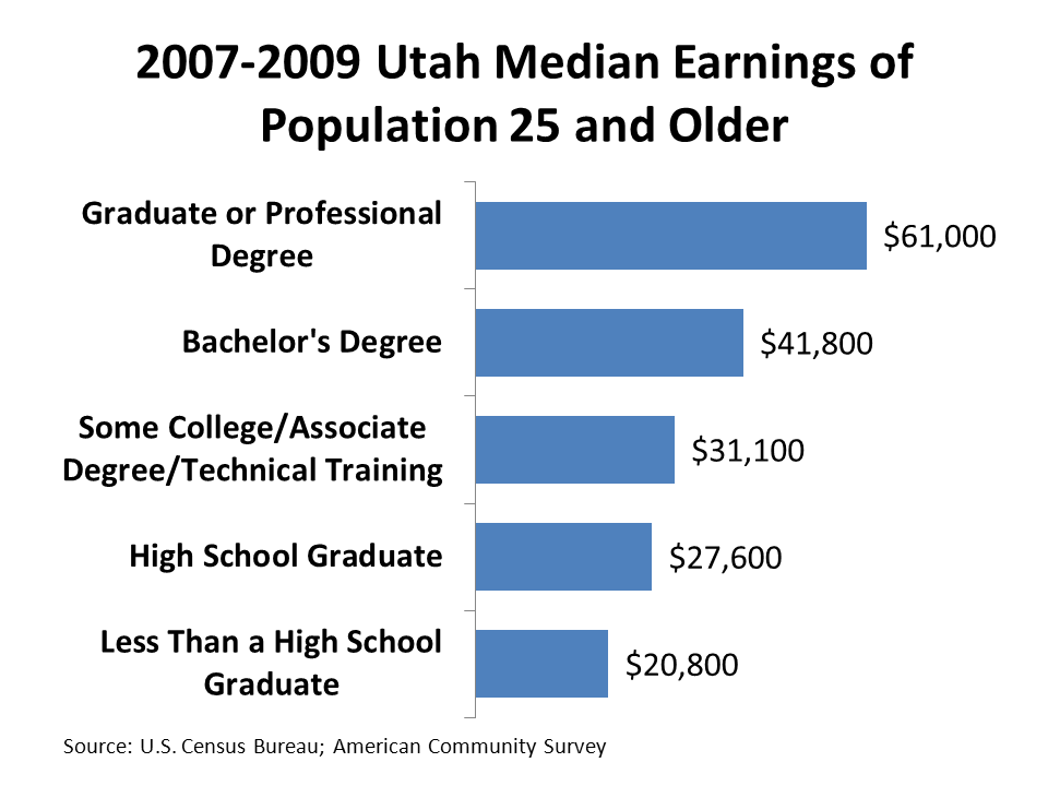
On the other hand, data does tell a story about the benefits of higher education. First, the higher an individual's educational attainment, the less likely they are to be unemployed (see the accompanying chart). Incidentally, we see the same pattern with unemployment insurance claims. Second, in general, income and earnings are higher (see the second chart). Third, there are more openings in Utah for people with at least a bachelor's degrees than for individuals with technical/associate degrees (see the third chart).

Individuals with at least a bachelor's degree pay more taxes and are less of a drain on social services. They are healthier. If you want to read a detailed accounting of the fiscal impacts adult education check out this report by the Center for Labor Market studies.

Plus, we shouldn't get too hung up on field of study. Obviously, even people with sociology and history degrees--which might seem unmarketable--are employed. Just look at the unemployment rates for people with degrees. Out in the labor market many, many positions require bachelor's degrees, but aren't very particular about the field of study. Check around with your professional friends and acquaintances. Personally, I know high-level managers and professionals with degrees in history, sociology, English, psychology etc.

Finally, students of economics will be glad to know that markets do work. In Utah, the number of jobs that require at least bachelor's degree is roughly equivalent to the share of the labor force that has a bachelor's degree or higher.